 In this tutorial, I’ll teach you how to make a colorful and vivid abstract artwork completely from scratch with Illustrator. There will be no need of stock images. You can always make a small sketch how you’d like your composition to be. But that’s not completely necessary because we will be creating the composition while playing with shapes.
Author: ViniMan
My name is Vincent Vander Cruyssen. I live in the Dutch part of Belgium (Flanders) and I'm 16 years old. Since this year I am studying Multimedia, going from learning to edit photo's to animating. I'm highly interested in music, and in creating it. You can check my stuff at deviantART, Behance, etc. with nickname ViniMan.
Final Image Preview
Below is the final design we will be working towards. You can view the final image preview below or view a larger version here.Step 1
Start off by opening Adobe Illustrator, if you haven’t already. I hope you have already met most of the tools, as this tutorial is targeted at the intermediate Illustrator user.
Let’s begin. Create some geometrical objects; circles, triangles, lines, spirals, etc. Place them in a fun color scheme; I picked CMYK to have a good example and because I like it. If you really have no idea, you could always take a look at the Adobe Kuler website.
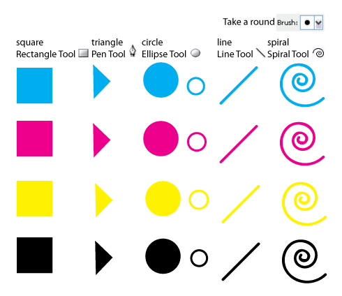
Step 2
With the objects you’ve just made we will be creating our entire piece. Arrange them in a fun way, so you get a nice composition. This is something you’ve got to do with your eyes and your mind. Play with them. And don’t use every object in every color. For example for the key (black) I only used a triangle. Let yourself go. You don’t have to keep the entire objects too. As an example, I cut some circles in half using another square and the Pathfinder window, see the following:
- Create a circle with the Ellipse Tool, holding shift while clicking.
- Draw a square with Rectangle Tool and place it above the circle.
- Select both the square and the circle.
- Open up the Pathfinder window, found in Window > Pathfinder. Pick the Subtract From Shape Icon and press Expand.
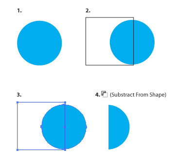
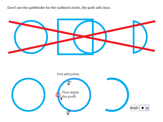
I also cut pieces away from the stroked circles. But you can’t do that with the pathfinder, because the path will close that way. The thing you’ll have to do here is add anchor points where you want the line to end and after that delete the points you don’t want to be there.
If you played enough with them you could get something like this. But please don’t create exactly the same thing, that would be really silly and you don’t learn anything by doing that. Everyone can copy paste. Work on experimenting with your composition.

Step 3
I think it needs something extra, something fun. Some swirls are always a pleasure to the eye. Let's explain one way to create them, so that you could even paint with them. Take note of the following tips:
- Create a Rounded Rectangle.
- Delete the necessary points.
- Hit the last point with the Convert Anchor Point Tool, found on the same place as the Pen Tool in the Toolbar.
- Go to the Brushes palette, Window > Brushes or hit F5, and Create a New Art Brush.
- When you create swirls, don’t hesitate! You’ve got to create with one smooth motion. If it’s not good looking, start over. You can always use the Smooth Tool found on the same place as the Pencil, right under the Brush tool. If you’ve got a Wacom drawing tablet, use it. It comes in very handy, because the swirls are coming right from your hand this way.
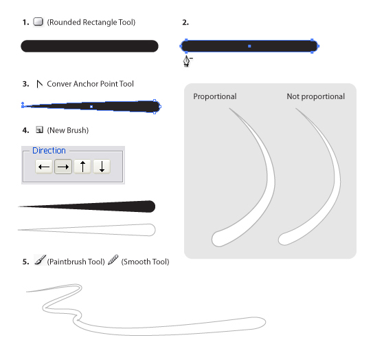
Step 4
All of the objects still have flat colors. This is in my opinion a little boring. Adding lighting and shadows – both inner and outer - will make the piece a lot more attractive. And this is something you can do in lots of different ways.
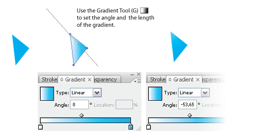
First, I’ll start with the easiest one, using a gradient on an object. Set the gradient angle and the gradient length with the Gradient Tool (G). We don’t have to search for a lighter color. Instead use a lighter tint of the objects color.
Step 5
To give lighting and inner shadows to circles is nearly the same, except you duplicate the the shape, add a gradient, and lower the opacity. See the following:
- Create a circle.
- Duplicate the created circle. Add a Radial Gradient.
- Lower the Opacity to something around 50%.

Step 6
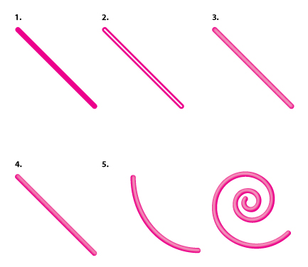
To give lines lighting you need to use a whole different method. You can work with gradients, but only if the line is straight. The gradients won’t be following the lines turnings. And the way I’ll explain is easier anyway:
- Draw a line with the Line Tool.
- Duplicate the line, put the stroke color on white and lower the stroke width to the half of what it was.
- Go to Effect > Blur > Gaussian Blur... The amount of pixels depends on the width of the stroke.
- Scale the blurred white line and move it a little up or down. Optionally you can lower the Opacity to 75%.
- Some additional examples shown below.
Step 7
To create even more depth between all the objects I gave some objects a little shadow, see the following:
- Create a circle.
- Duplicate the circle, give it a black fill color, place it underneath the original circle and move it a little.
- Go to Effect > Blur > Gaussian Blur... The amount of pixels depends on the size this time. Lower the Opacity to 50%.

Step 8
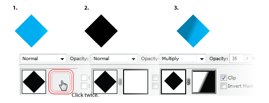
A technique to create inner shadings easily is working with masks. Just like you can do in Photoshop, nice and easy:
- Create a shape.
- Duplicate the shape and switch the fill-color to black. Go to Window > Transparency. Create a mask by clicking the empty spot next to the thumbnail of the shape twice.
- Draw a rectangle inside the mask and give it a black to white gradient. Click back on the thumbnail of the shape and lower the opacity.
Step 9
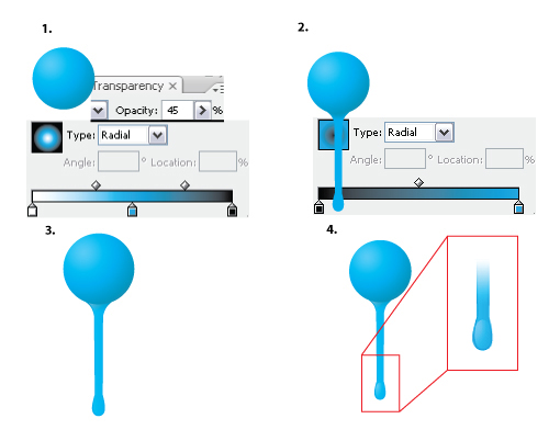
Now, we’ll add drips on places to make it more alive:
- Duplicate the circle, add a radial gradient and put the Opacity on 45%.
- Create a drip underneath the circle and give it a radial gradient coming from the top.
- Duplicate the drip, scale the width down and add a white gradient coming from the left with an Opacity of 40%.
- Create a circle for the end of the drip with a white radial gradient.
Step 10
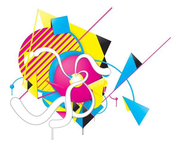
Now you’ve seen my techniques, you could be able to do something like the image below.
Step 11
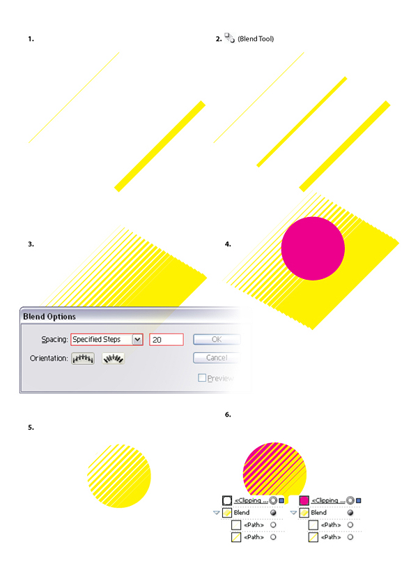
I’ll do some extra explaining on a few objects. The yellow line gradient on the magenta circle is fairly easy to create; you only need two lines with different widths, the Blend Tool and a circle.
- Create two lines with a different width.
- Use the Blend Tool.
- Press enter while the blended lines and the Blend Tool are selected, so that you can change the preferences. Choose Specified Steps for the Spacing, and put the number on around 20.
- Draw a circle on top of the blended lines.
- Select the circle and the Blend, go to Object > Clipping Mask > Make. Or press Command + 7.
- Press the Clipping Mask path and change its color.
Step 12
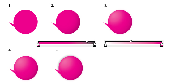
Here is how you need to create that magenta sphere in the middle:
- Create a circle and a triangle.
- Duplicate the circle, add a radial gradient and lower the Opacity.
- Duplicate the circle again, add a radial gradient, scale it down. Next, add a Gaussian Blur and lower the Opacity.
- Same thing with the triangle; duplicate, white gradient, scale down, add a Gaussian Blur and lower the Opacity.
- Add a shadow the same way I explained earlier.
If you are working with CMYK as Color Mode, you better set all the shadows of the Blend Mode to Multiply. If you aren't working for print design, and only keeping it to screen design, then you don't have to change all the shadows to Multiply. Putting the Color Mode on RGB solves it right away. Go to File > Document Color Mode > RGB Color.
I was planning on printing it so I stayed using CMYK. The reason why I had to put the Blend Modes on Multiply is because I didn't use rich black but key. Total key isn't 100% black, it's the 4th color of the CMYK spectrum. There is a rich black (a mix between Cyan, Magenta, Yellow and 100% Key) preset swatch in Illustrator, which you can use too. But it would have been even more work replacing all the Key's in the gradients with rich black. Putting the gradients and shadows with Key on Multiply does the job too, to make a more realistic black.
Step 13
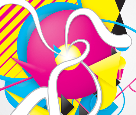
Where all the swirls join together I created a white light. You can do this is almost the way same as creating a shadow. Create a white circle, do a Gaussian Blur and lower the Opacity to something around 75%. I did a black masking on the swirl where I didn't want light to be.
Conclusion
If you want to show your piece to the your public you could finish it up by placing it inside Photoshop, sharpening it up, using a texture and creating a background. You can view the final image below or view a larger version here.


Wonderful Tutorial, thanks for putting this together! This is obviously one great post. Thanks for the valuable information .
ReplyDelete