My Blog for your Knowledge

We'll make sure your website works for you...

The Road to Web designing

Art Illustrations

Do you want to look great?

25 March 2010

Better Mobile Form Design

Trust me, no one likes filling in forms —especially on mobile devices where one-handed, on-the-go data input and slow connections are common place. As a result, designing forms that make mobile input faster, easier, and less error-prone is crucial. Here's a few ways it can be done.

To illustrate, let's look at two mobile forms for booking a hotel: one from the Expedia mobile Web site, the other from the Kayak iPhone application.

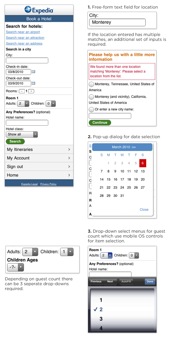
Expedia's mobile Web site has made several modifications to the desktop version of their hotel booking form: the layout has been optimized for slender mobile screens; the "search near" set of options has been listed out; and the room count input uses a set of "+" and "-" buttons instead of a drop-down menu for input. Yet, there's still room for improvement.

  1. The form uses a free-form text input field that requires users to provide clarifying information on another screen if a mistake is made. And in many mobile contexts (fat fingers, one-handed typing, on the go) —mistakes do happen.
  2. The date selection field makes use of a calendar pop-up that requires people to tap a small ">>" target to advance to the previous or next month.
  3. The set of inputs for guest count uses (up to) three drop-down select menus for input, which require manipulating a list of options in a pop-up list.

expedia  mobile form

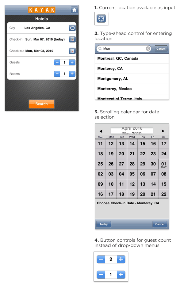
Kayak's mobile iPhone application also allows people to book hotels but it features a few additional mobile optimizations.

  1. Current location is available as a single click input in addition to a free-form text input. This allows people to search for hotels where they are now without typing.
  2. The free-form text entry field provides inline suggestions as you type. This not only reduces the amount of typing required (it only took me 3 characters to see Monterrey, CA), but it reduces errors as well. On the Kayak form, there's little need for the clarification screen Expedia requires.
  3. The date selection calendar allows people to use a simple scroll gesture to move between months instead of tapping a small target to change months. Users can just flick the calendar itself up or down through direct manipulation instead of having to use the ">>" control Expedia requires.
  4. The Kayak form doesn't use any drop-down menus, opting instead for "+" and "-" buttons that are easily tapped on a touch screen. (I'm not sure why Expedia uses these for room count but not guest count as both inputs only need to support a small number of possible values.)

Kayak  mobile form

In aggregate, these small enhancements go a long way to making forms on mobile devices faster and easier for people to complete.

20 March 2010

Create A Beautiful 3D Text Composition

http://design.creativefan.com/files/2010/01/finished200.jpg

3D text effects are common elements in graphic design and advertising. The extra depth dimension allows images to visually pop from the page, and provide excellent building blocks for development of an image. A variety of tools can be used to create them, but creation of 3D text effects often requires significant time, patience, and knowledge.

In this tutorial, Joe Moore will teach you step by step how to render beautiful and visually sharp 3d text in 3D Studio Max, render it using Mental Ray, and then combine it with additional visual elements to create an atmospheric, nature inspired 3D text composition using Photoshop. If you don’t have 3D Studio Max, fear not, for a beautiful PNG render is included so you can still follow the Photoshop section.

This tutorial is jam-packed with techniques, tips and tricks to improve your workflow and design skills. Whether you’re a rookie designer looking to learn new techniques to use, or you’re a veteran designer just looking for tips on taking your images to the next level, you’ll find a ton of useful information here.

Continue reading »

18 March 2010

Best of ‘3D Studio Max’ Tuts

Modeling Nokia 5800 Phone in 3D Studio Max (Video Tutorial)

http://www.designshoot.com/timthumb.php?src=http://www.designshoot.com/wp-content/uploads/2009/10/nokia_final.jpg&h=170&w=235&zc=1

This tutorial dedicated for beginner and intermediate 3d studio max users, here you’ll learn how to create a realistic Nokia 5800 xpress music phone quickly. All techniques shown at this tutorial can be applied to other 3d application easily. And the methods of making the phone itself are fast, and very efficient. Though the resulting [...]

Making Realistic Gold, Silver and Copper Materials in 3DS Max

Making Realistic Gold, Silver and Copper Materials in 3DS Max

This tutorial will guide you step by step to create gold, silver and copper materials on 3d studio max. This tutorial could be practiced both of the beginner and professional 3d max users. Here you’ll learn how to set up and mix the RGB color, reflection, specular, index of refraction fresnel, and fall-off. to create [...]

Create Amazing 3D Poster Design using 3D Max and Photoshop

http://www.designshoot.com/timthumb.php?src=http://www.designshoot.com/uploads/jan-10/poster-3d.jpg&h=170&w=235&zc=1

This tutorial will guide you step by step creating an amazing poster design using 3d studio max and Adobe Photoshop, 3d studio max used to make a 3d text and then 80% you’ll work using adobe photoshop, you can use this similar technique to create a flayer, posters, or invitation for promotes a company or [...]

Modeling Realistic Jungle Environment using 3D Studio Max

http://www.designshoot.com/timthumb.php?src=http://www.designshoot.com/uploads/februari-09/making_of_the_jungle.jpg&h=170&w=235&zc=1

This is a tutorial how to make a jungle view complete with tree, grass and the hut, you can learn about some techniques that was used in creating the jungle scene in 3ds Max 9 to create another model depend on your creativity.

Modeling Minimalist Bedroom with 3D Studio Max

http://www.designshoot.com/timthumb.php?src=http://www.designshoot.com/public_html/uploads/november-08/bedroom-3d-model.jpg&h=170&w=235&zc=1
Step by step tutorial to modeling a minimalist bedroom using 3d studio max, you must have basic skills of 3d studio max and familiar with Radiosity to complete this tutorial, helpful tutorial for interior designer, or Architect. You can download the max files for free.

Video Tutorial - Create Realistic Interior Rendering Using Mental Ray

http://www.designshoot.com/timthumb.php?src=http://www.designshoot.com/uploads/november-08/interior-lighting.jpg&h=170&w=235&zc=1
Video tutorial to create an artistic and realistic interior design views using Mental Ray. The video duration is 12 minutes. It’s soundless video tutorial and will explain you how to use Sunlight, Skylight in the daylight interior scene and render through mental ray. The designer also will show you how to correct the color after [...]

17 March 2010

How To Market Your Mobile Application

App Store is a competitive environment. Against more than 140,000 apps, all screaming for attention, how do you make sure your app gets its time in the spotlight? What does it take to get good media coverage? How do you get people to talk about your app—and, ideally, how do you get them to buy it and show it to their friends?

How To Market your App

Following the simple rules laid out below, you will increase your chances in the battle for fame and glory. These tips might seem rudimentary or in-your-face obvious, but they are so often neglected in the heat of the moment.

Read more...

15 March 2010

Design a character for a T-shirt print

Speakerdog creator Ben the Illustrator, guides you through your own character creation – and then from screen to printed T-shirt.


Character creation is a personal thing. Anyone can doodle stick drawings and scrappy characters, but armed with an insider’s knowledge of cracking character design, you can breathe life into any design.

Characters can be created in any application – from 2D pixels to 3D models – but vector-based artwork holds a special place in any creative’s mind. And vector-based characters can make the jump from screen to screen-print with ease.

For this tutorial, Ben the Illustrator reveals the process he goes through to create one of his famed characters – and he has created a special character just for Digital Arts readers.

His original sketch is also included on the cover CD so you can follow along and learn that good characters come down to background, colour, and line control. The secret, though, isn't just about pixel pushing.

Character design involves actually getting to know your character and its reason for being. One trick is to keep a scratchpad handy with you at all times, and especially on your studio desk.

When you fancy, doodle, draw and explore character shapes and designs, gradually building up a look-&-feel to your design. At the same time, explore what motivates your character – and what message it is trying to bring to the viewer. Once this is solved, the actual design in Illustrator is made far easier – and designs can be modified for a genuine reason.


Step 1
Before sketching your character on paper with a pencil, you need to decide what it will be (human? dog? flower? suitcase?) and think about its personality and the feeling of your piece. Is it to be heartwarming, intelligent, or violent? Keep experimenting with your sketches to find the perfect design. Try different ways of drawing facial features and body shapes.


Step 2
It’s also worth giving it a purpose. Is it to be informative or entertaining? What will it bring to the viewer? You may want to add props to strengthen its integrity or charm. In this tutorial, we’re going to be working with Sanchez, an office boy/flower that tells us all to spend less time in the office and more time outside.


Step 3

Now, sketch its environment – where does your character live, and what is your illustration as a whole going to depict? Ensure the illustration style of your landscape and character work together, even if they differ slightly. Try and keep your sketch fairly clean, it will help when you come to tracing in Illustrator.


Step 4
Once drawn, scan it in. If possible, scan at a high-resolution (300dpi is recommended) as you may need to zoom right into the sketch to trace smaller details later, and save your scan as a JPG and import it onto your artboard in Illustrator (File>Place). To help with this tutorial, the original scan is included on the cover CD.


Step 5
Next, we’re going to trace the sketch. Ensure you retain the natural curves you put into the sketch. Relying too much on the bézier curves created within Illustrator can make your character look too plain or unnatural, being made up of regular graphic shapes. It’s worth spending time over the tracing, as it can be tricky going back to this stage once the image starts coming together as a whole.


Step 6
Illustrator has three brilliant tracing tools, especially if you are using a Wacom tablet and pen; the pencil retains a very natural line, although it can be a little shaky. The paintbrush allows varied line thicknesses and can work wonderfully for a fresh adaptation of the traditional tool. The pen tool is incredibly clean but the bézier curve function can take some time to get used to.


Step 7
Where possible, group your objects according to what colour they will be later, allowing you to colour them all at once and try colours more easily without having to go through and select each object individually. Select the objects using the direct selection tool, then group using Cmd/Ctrl+G. For example, if you have a field full of same-coloured trees, group them together in the layers panel.


Step 8
Illustrator has some wonderful colour swatches (Window>Swatch Libraries) some of which are particularly formatted for print processes, for example Pantone Solid Uncoated which is solid (neither pastel nor metallic) colours to be used on uncoated print stock, such as art prints on watercolour or textured paper. It can be a bonus to always use Pantone swatches so you can easily get the Pantone codes if required by a printer or your client.


Step 9
Don’t just choose colours that look nice. Pick colours that set the scene, create an atmosphere, depict a time of day and add depth to the scene as a whole. Here we are going for an airy, spring afternoon. Also, don’t be afraid to experiment with the outlines, either colouring them, or taking them out. Landscapes without outlines have a more authentic air to them.


Step 10
When colouring your character, really take your time to get it perfect. Consider whether or not the colouring could confuse the viewer (colouring a zebra in two tones of brown may just make it look like a horse, for example). Colour the predominant areas of the character first, then colour the smaller areas and props to complement.

Step 11
Illustrator has some wonderful graphic tools, so make use of them. The star tool can add a kitsch effect. Click on the Rectangle tool and scroll along to the star, then click on the artboard and enter the values required. Colour gradients always add a satisfying depth, and you can also break your faded gradient into tonal bands (select the object with the gradient, then click Object>Expand and decide how many bands of tone you require).


Step 12
Look at your masterpiece as a whole, and to ensure the character fits comfortably into the scene, consider adding a shadow. Use the pen tool to draw the shape then select a darker tone of the colour you have on the ground, and reduce the opacity (Window>Transparency) to suit.


Step 13
If you are keeping the outlines on your illustration, make sure they are all correct and of a balanced thicknesses throughout. Thick lines in the distance can make a scene look incredibly clumsy. If you have text, whether it’s a title, tagline, or in a speech bubble, take some time to choose a font that suits your character’s personality and the style of the scene. If you continue to use your character, the font may be a useful branding tool for future creations.


Step 14
Don’t just choose colours that With your character’s first illustration complete, consider taking him/her to other places, locations and situations, build on its life story and personality. Taking your character to different landscapes can improve your skills having to evoke different types of scene but each being part of a series in the same style. Or you could take your character into other media…


Step 15
T-shirts are always a popular medium for fresh design and illustration work. Our design will have to use a limited number of colours – most T-shirt printers ask for four colours or less. Consider adding slogans or different graphics to your previous landscape image. Think what works well on T-shirts, and what products would you buy yourself? Many T-shirt printers also make belts, bags, pin badges, and other products.


Step 16
To get your artworks out into the world you could sell them as art prints (giclee prints are cost effective and high-quality), postcards or stickers (both can be great promotional tools and are available from many online suppliers). Try and include your URL or contact details – you never know who may see your character.

13 March 2010

How to paint using the Gradient Mesh tool

Gradient Mesh is a grid-based painting technique in Illustrator that enables advanced colouring of vector objects with smooth and malleable color transitions.

If you’re reasonably familiar with Illustrator’s Pen tool and other path-drawing, selection, and colour tools, you can use the Gradient Mesh feature to add realistic colouring, lighting, and 3D characteristics to a flat vector object. Ultimately, gradient mesh can give you the effect of photo-realistic painting with all the benefits and freedom of resolution-independent vector artwork.

The Illustrator Create Gradient Mesh dialog.

Why use a gradient mesh? Gradient mesh is usually compared to three other colour techniques: standard gradients; object blends in Illustrator; or painting in Photoshop or Corel Painter.

Gradient mesh vs. standard gradient: Standard gradients are extremely limited. You can choose between linear gradients, which transition from one colour to the next in a straight line, and radial gradients, in which colours transition between concentric circles. A gradient mesh can transition colors in any direction, in any shape, and can be controlled with the precision of anchor points and path segments.

Gradient mesh vs. object blend: Blending objects in Illustrator involves selecting two or more objects and creating intermediary objects that morph into each other. For example, the blend of a red triangle in front of a blue square would create additional objects between the two that gradually morph the shape and colour of the triangle into those of the square -- at the exact midpoint you get a purple shape that is half triangle, half square. Object blending is an effective way to create irregularly shaped color transitions and gradients, but it’s labour intensive. Each new gradient must be created as two objects -- the starting and ending color object -- and blended individually. A gradient mesh, on the other hand, is a single object inside of which different color areas transition into one another with the effect of a blended object.

Left to right: Colour transitions in a gradient mesh object, an object filled with a standard (radial) gradient, a blended object, and an image coloured in Photoshop

Gradient mesh vs. painting in Photoshop or Corel Painter: Painting in Photoshop or Painter is far easier than creating a gradient mesh. But such painting means working with fixed-resolution pixels. Conversely, a gradient mesh in Illustrator is a resolution-independent vector object, which means you can scale it up or down to infinity and maintain its original quality. Pixel-based imagery loses quality as it’s scaled up. Moreover, colours in a gradient mesh object can be perpetually adjusted and altered, whereas adjusting a painting in Photoshop requires re-painting, potentially destroying data.

Creating a gradient mesh

Creating a gradient mesh is fairly intuitive once you grasp the basics. So let’s get started by colouring a simple tomato via a gradient mesh.

The path that will become a tomato.

Begin by drawing the shape of your tomato as a single closed path with the Pen, Pencil, or shape tools.

Choose a base color for the tomato, and fill the path with that colour. You can pick any colour you like, but for reference I started with RGB: 185, 44, 7.

With the tomato path selected, choose Object->Create Gradient Mesh. You will see the Create Gradient Mesh dialog.

Because a gradient mesh is a grid, when converting a path to a gradient mesh object, you must initially divide the object into expected areas of colour -- you can add and remove rows and columns later. At each intersection of column and row lines within the grid is a mesh point, which behaves very much like -- and may be called on your screen -- an anchor point, which controls the direction and curvature of path segments emanating from it. The difference is that a mesh point can also hold a colour value, and that is the whole point of a gradient mesh. Colours transition between mesh points. For instance, in a 2-by-2 black mesh, colouring the centre mesh point white will create a smooth gradient from that centre point outward in all eight directions -- up, down, left, right, and toward each of the four corners.

A basic 2-by-2 gradient mesh with the
centre mesh point coloured white and
all others coloured black.

In the Gradient Mesh dialog, choose a suitable number of starting columns and rows. How many you start with depends on the size and shape of your tomato or other object. You want enough rows and columns to easily colour the tomato with light, shadow, and different surface colours, but you always want sufficient space between columns and rows that colours will transition smoothly rather than sharply. The further away two mesh points are, the smoother and more subtle the change between their respective colours; the closer two mesh points are together, the sharper the colour transition.

Turn on Preview (if it is not already on) and notice that the mesh lines, which comprise the grid, are not perfectly horizontal and vertical; they adapt to the shape of the object defined by its outer path. Thus dimensionality is often already infused into the gradient mesh object.

To follow my lead, begin with 8 rows and columns. Appearance should be Flat and the Highlight 100 percent. Click OK.

The path converted to an 8-by-8
gradient mesh object.

The tomato is now a gradient mesh object, with all the mesh points selected (notice that they’re filled or selected rather than empty points). Switch to the white arrow Direct Selection tool and individually select a mesh point, and then change its colour by choosing a swatch from the Swatches panel or mixing a new colour from the Color panel. To give the tomato its first highlight, select a mesh point near the top left and colour it white. If the highlight you get is too small, colour other mesh points around the first white.

If the shape of the highlight isn’t exactly what you want, you can move mesh points with the white arrow and even drag their curve handles to reshape the mesh lines attached to them, and thus the direction and depth of their colour transitions. Remember, mesh points behave just like anchor points; the only difference is that they also contain colour data instead of just curve direction and depth data. You can even use the Convert Anchor Point tool on mesh points to change them from smooth to corner points or manipulate the curvature of mesh lines on either side independently.

The initial highlight. There are curve handles
on the mesh points.

If you need more mesh points, switch to the Mesh tool, which is located on the Tools panel between the Column Graph and Gradient tools. When you click with the Mesh tool in a mesh patch, the empty space between rows and columns, you’ll create a new row and column. Clicking the Mesh tool directly on a mesh line, however, will create a row or column—clicking on a vertical mesh line creates a new row at that point, clicking on a horizontal mesh line creates a new column. If you add a new row or column to an area that has already been colored, the resulting mesh points will pick up the colors at the point of insertion.

If you need fewer mesh points, perhaps because colors are transitioning too sharply, hold down the option key and click with the Mesh tool on a mesh point. That will delete the column and row intersecting at that mesh point.

Note that you can also assign color to the mesh points at the outside of your path shape, at the ends of column and row lines. This is how I gave my tomato the backlighting on its right edge.

For larger areas of color, the shadow on the front of my tomato for instance, click with the white arrow (not the Mesh tool) inside a mesh patch. That will automatically select, and enable you to color simultaneously, all four mesh points that define the shape of that patch.

Colour four mesh points at a time by clicking
within the mesh patch rather than on a specific
mesh point.

Continue colouring until you’re happy with the result. If you make a mistake, use Command-Z to undo, or just recolour the mesh point; they’re always editable, even after saving, closing, and re-opening the Illustrator document.

When the tomato is done, you can finish it off with leaves and maybe a stem, each of which can also be colored via a gradient mesh.

Believe it or not, the tomato I used for this example took me only 15 minutes to create from start to finish—including drawing the initial paths and adding and colouring the leaves and stem. Initially, your artwork might take longer; but with a little practice, you can quickly create stunningly coloured gradient mesh objects.

The finished tomato, complete with gradient mesh leaves and stem, and a standard radial gradient cast shadow.

In part two of this tutorial, which runs on Monday, I'll outline some easy keyboard shortcuts you can use to accomplish the tasks above.

Pariah S Burke

11 March 2010

Forms On Mobile Devices: Modern Solutions

Mobile forms tend to have significantly more constraints than their desktop cousins: screens are smaller; connections are slower; text entry is trickier; the list goes on. So, limiting the number of forms in your mobile applications and websites is generally a good idea. When you do want input from users on mobile devices, radio buttons, checkboxes, select menus and lists tend to work much better than open text fields.

Screenshot

But constraints breed innovation, and mobile forms are no different. The limitations of mobile devices have forced developers and designers to find new ways to allow users to input data faster and more easily. Thanks to the modern solutions covered in this article, the mobile space may not be a place to avoid forms much longer. Instead, it may become the place to encourage them.

Read more...

Exterior Scenes in 3d Max

Author: Lon Grohs & Rodrigo Lopez

Responsible for some of the most iconic architectural photographs of all time, Julius Shulman once described that in order to teach his photography students to photograph a subject, he asked them to first put their cameras down and learn to "see" the subject first.

Developing an understanding of the subject and discovering how to best portray its character is a crucial step in composing your image. Is the subject contemporary, modern, classic, historic, minimal, and so on? Depending on the design of the structure, different sensibilities may apply. And while we don't have the capability to put down our cameras and walk around the space, we do have an extraordinary freedom to place any number of cameras in our virtual space. Additionally, the new Walk Through Camera is a useful tool for taking a quick, informal virtual walk around the model to discover potential views and photogenic elements.


Using the Walkthrough Camera is a great way to "discover" the virtual space.


Below are the shortcuts for using the Walkthrough Camera.


(Note: the Level Command is very useful, especially for straightening verticals.)


It is also useful to set up a quick Sunlight System to light the scene in a quick but realistic way, even if the materials are simple colors and shades. The interaction of the light with the scene is an important aspect of the composition. Sometimes the patterns and dynamic lines created by light and shadow can be more interesting than the structure itself.


Keeping in mind our Rule of Thirds and Diagonal Rule from our earlier tutorial, we see that the same notions apply with exteriors.


Rule of Thirds


Diagonal Rule


Experimenting with various camera lenses and aspect ratios can also create engaging compositions.


Exaggerated Aerial


Dutch Angle (Rotated Horizon)

Modeling (ACAD/Revit/SketchUp Into Max)

1. Introduction

There are many different ways of importing files to 3DS Max. Many people have their own methods, but you'll find the best process we've used via AutoCAD, Revit, and SketchUp.

2. ACAD

a. Method A
Basically, this method is about how to clean the CAD files before you import into 3DS Max so that you can use this CAD file as reference and modeling in 3DS Max

- Clean up CAD files that you don't need such as electrical installations, structural elements, notes, specifications, etc.


- There should be no "XREF" file present. If so, you need to insert or bind or you can try the "include XREF" option but we prefer binding XREFs and cleaning this XREF file as well.

- Sometimes there are blocks in the CAD files. You can either "explode" them or you can turn on "Convert blocks to groups" option when you import into Max.

- Make separate lines for each shape. Max will import your file as separate lines and then organize your layers by the same components (we normally make layers by materials) such as walls, floor, ceiling, trim, wood, stone, fabric etc.

- When importing files into Max, we usually use "Legacy AutoCAD" or "AutoCAD Drawing". It depends on how you are going to use them.

- Let's do "Legacy AutoCAD" for this example. There is "Combine Objects by Layer." That is why you need to use layers in AutoCAD, so that Max imports the object by layers as well.

- Freeze the imported CAD and trace the line that you are going to create.


- Now you can apply "Extrude" modifier into this line to create walls, etc.

b. Method B

This method is more about interactivity between CAD files and Max. In other words, if you change something in the CAD, Max will instantly update based on the CAD file. In order for this concept to work, there are certain things that you need to consider and understand about the concept. The most important thing would be "polyline."

- Polyline must be closed. In most CAD drawings, polylines are not closed or are single lines drawn on top of each other. So you need to redraw clean, closed polylines by layers.


- In Polyline options, there is "Thickness." Not only will you be able to create a simple 3D geometric shape, but also it will instantly update in 3DS Max.

- The "thickness" is basically how much you can extrude so if you type 10'-0" then it will extrude from polyline and create a 3D form.


- Now organize the layers by components and you're ready to import it into 3DS Max.

- In Max, go to "File" and select "File Link Manager."


- In "File Link Manager" you will be able to customize, preset and link the file.


- As you see, you will be able to tell the polyline that has "thickness" as it will have the extruded modifier automatically applied.


- Let's give different thicknesses to certain polylines in CAD, and let's move some of the wall vertexes. Then reload the CAD file in Max.


- You will notice it instantly update whenever you save changes in the CAD.

3. Revit


This part of the tutorial will explain how to import a Revit model in 3DS Max. It expects little experience with Revit and a solid understanding of 3DS Max.

- Need to be in a 3D view in Revit

- Export it out as AutoCAD DWG format

a. In Revit

FileExportCAD Format


b. In 3DS Max

File linking - The best way to bring any AutoCAD DWG is File Linking Manager.


If the original file in Revit has a different unit system, you can check "Rescale" and select inches from the pull-down menu.

There is a preset that is already set up for Revit on the dialog box.

Check "Use scene material assignment on Reload" if you want to bring materials that were assigned in Revit to 3DS Max.

If you want to assign new materials in 3DS Max, you need to keep this box unchecked.


We have linked the model now in 3DS Max.

The layers and object naming will be saved, so everything is well organized.


You can go any time to the File Link Manager to reload the file back in 3DS Max. If you have assigned new materials in 3DS Max, the 3DS Max materials will be maintained so we do not lose them.


The materials that were assigned in Revit will save all their qualities and naming.

All the camera views will be maintained as well.

The file is ready now for lighting and rendering.

4. SketchUp

This final portion of the tutorial will explain how to import a SketchUp model into 3DS Max. It expects little experience with SketchUp and a solid understanding of 3DS Max.

These instructions were recoded from practice using SketchUp Pro6 and 3DS Max version 9. However, it is believed that the instructions will be applicable to earlier versions of 3DS Max.

a. In SketchUp Pro

Get the model from Google Earth in SketchUp by using the Get Models button to access the model from the 3D Warehouse.


Download the model.


Prepare the model for exporting to 3DS Max.

1) Save your model.
2) Orient all faces correctly. Any face that is blue is facing the wrong direction. You will need to reverse all faces that are oriented incorrectly or they won't display in 3DS Max.
3) Add pages for your desired render views.

SketchUp export options 锟� the common export options are DWG and 3DS.

Export as DWG 锟� by exporting it as a DWG, everything gets pre-welded. So if the model is not organized in layers or components, the best way is to export that as a DWG.

(SketchUp surfaces are independent from one another, so basically you just have a bunch of surfaces that are adjacent to each other and are not actually connected. By welding the points, you'll be able to smooth it out.)

Select "File," then "Export" and then "3D Model." Click the "Options" button and be sure to select "Faces."


b. In 3DS Max

Now import the model into 3DS Max. Click "File" and select "Import." Then choose .dwg file. Navigate to your model and select it for import. Max will prompt you to merge or completely replace the scene 锟� choose "Replace."


Look at the image above for settings.

The model is now imported into 3DS Max


Collapse the model in Editable Mesh, because the model is a Viz Block.


Separate the elements by ID and detach them in order to apply new 3DS Max materials.


Export as 3DS

One advantage of the 3DS export is that it saves the step of doing material assignment in 3DS Max.

Other things to consider are:

- Don't use instances as they just don't show up once imported

- Don't change the pivot point or your object won't be in the correct location once imported

Group by texture before exporting

When you export from SketchUp, check "Export texture maps" and "Welding vertices" in the options. All the surfaces that are smooth in SU will be smooth in MAX/VIZ.

Make sure you select "Export Cameras from Pages" so that you can have the same views in 3DS Max set up that you made in SketchUp.


Look at the image above for settings.

Import

Now import the model into 3DS Max. Click "File" and then select "Import." Choose .3ds for the file type.

Navigate to your model and select it for import. Max will prompt you to merge or completely replace the scene. Choose "Replace." Different from the DWG version where the file is translated to a Viz model, the 3ds file is translated to an Editable Mesh.

Apply the materials

It doesn't even matter what they are as long as (for example) everything glass is the same material, everything rock is the same material, all water is the same, etc. Now when you get into 3DS Max, open the material editor. Select the first slot and click on the Pick Material (eyedropper icon). Then click on a material in your model. Sometimes it will assign all materials to sub maps automatically. Other times you will need to go through and assign each material manually to a new slot. Either way, just go through and select each material you want to change.

Once it is assigned to a material slot, you can change the material and it will change all objects with that material in the model.

If the material is using a texture map, then you will need to change the path of the maps on the diffuse.


The texture maps are saved automatically on the same file where the exported 3ds is located.


Now the texture is reloaded and the file is ready in 3DS Max.

Lighting

Lighting is one of the most important parts in 3D visualization rendering. It brings not only the look and feel for the image, but also helps to visualize the design in reality. Many artists will find themselves spending more time with interior lighting to make sure every detail in the room is lit perfectly. Exterior lighting is easier to set up but still challenges the artist.

1. Modeling

Here we have a model of L5’s exterior. The entire model is created based on a CAD plan, then imported into 3D Studio Max and organized into layers.

Exterior Scene Part 3 鈥� Lighting

2. Texturing

Textures and material information are collected and then applied to the model.

Exterior Scene Part 3 鈥� Lighting

Exterior Scene Part 3 鈥� Lighting

All the materials in the scene are Vray materials.

In this scene, besides some basic material, we also apply Vray displacement on the grass to make the render look more realistic and detailed.

For the grass, we use 2D mapping type for Vray DisplacementMod with a grayscale grass bitmap for displacement effects.

Exterior Scene Part 3 鈥� Lighting

3. Camera View Setup

After applying all textures to the model, we set up a couple views and end up with this final view.

Exterior Scene Part 3 鈥� Lighting

4. Lighting

Similar to lighting an interior scene, we start with environment light first. Again, it is a good practice to collect all the reference images about the kind of lighting you want to apply into the scene. In this case, we want to use daylight with yellow sunlight coming down from the right and hitting the whole building’s section. The right part of the scene will be in bluish shadow. Both yellow and blue colors will compliment the image.

Instead of using GI Environment (skylight) in Vray render setting dialogue as we used in interior to create ambient light, we use a different way by creating a semi-dome to simulate the sky.

Exterior Scene Part 3 鈥� Lighting

We apply VrayLightMtl with a Sky bitmap for the dome, and also apply UVW mapping cylindrical type for it as well. The benefit of this method is that it creates more natural-looking ambient light and it has bright and dark areas just like a real sky would look. When applying the bitmap on a VraylightMtl, it will reflect those dark and bright areas on the bitmap onto the object to create a more interesting look for the image.

This method sounds the same as the HDRI method but easier to create and adjust since you can move, rotate or even scale the map on the viewport to suit your lighting look or even reflection on the object. Unlike HDRI, you have to enable the background on your viewport and put in some numbers to get it to look right.

For now, we leave the value of brightness at 1.

Exterior Scene Part 3 鈥� Lighting

After that, we can go ahead and do a test render. We used a very low setting for test rendering images in order to get a quick preview of the image.

>Color mapping: Exponential

>Irradiance map was set to low

>Light cache with Subdivs at 200 and sample size at 0.02

Exterior Scene Part 3 鈥� Lighting

It looks very dark at this point, but we can see some interesting effects on the ambient light. Since we are aiming for a bright-looking day, we need to increase the multiply of the VraylightMtl from 1 to 6.

Exterior Scene Part 3 鈥� Lighting

Do the test again to see how it looks.

Exterior Scene Part 3 鈥� Lighting

This looks better. We get the shadow to look bluish as we wanted. The render’s quality looks really bad due to very low setting of GI, however we will set a higher setting after we get the lighting to look right. This way can save you a lot of time.

Now, after you get the correct look for the ambient, let’s add some sunlight. Again, we use Vray light, Sphere type to simulate the sun, with strong yellow color. The bigger the radius of the light, softer the shadow.

Exterior Scene Part 3 鈥� Lighting

We also add furniture, some plants, flowers and trees to add more details into the scene.

Exterior Scene Part 3 鈥� Lighting

Now, we are ready for the final render.

5. Render Setting For Final Image

For a final render image at 4000 pixel, we change the setting so that it is higher than before to bring more quality to the image.

For GI method, we used Irradiance map for Primary bounces and Light cache for Secondary bounces at a high setting.

Exterior Scene Part 3 鈥� Lighting

Exterior Scene Part 3 鈥� Lighting

We chose Adaptive QMC for Image sampler and Michell – Netravali for Antialiasing filter.

Exterior Scene Part 3 鈥� Lighting

For post work, we also rendered out the VrayReflection pass, VraySpecular pass and VrayZDepth pass (you can add these passes by going to Render Elements and click the Add button).

6. Post Work

We use Photoshop for post work. Level adjustments and Color Balance are used to improve the contrast and color for the image.

A real sky background is added for more realism.

Reflection and Specular passes are used to add more reflection and highlight for the image to provide more realistic effects.

We also render out a Vray Dirtpass render so we can use it in Photoshop to boost the shadow.

Exterior Scene Part 3 鈥� Lighting


Some close-up details:

Exterior Scene Part 3 鈥� Lighting

Exterior Scene Part 3 鈥� Lighting

Exterior Scene Part 3 鈥� Lighting

And there it is. We get the lighting as we wanted. It is quite simple as you can see, but it sure is full of challenges to get the right look for the final image. I hope you will get other ideas in lighting an exterior scene as well.

Enjoy!

Rendering and Post
1. Introduction

Before we began work on the L5 project, we spent quite a bit of time trying to find the right look for the imagery we were going to produce. The art direction was influenced heavily by the work of photographer Julius Shulman, the American architectural photographer best known for his work featuring icons of modernism like Pierre Koenig’s Case Study #22 in Los Angeles. We also wanted to accentuate the location of the project by really playing up the desert setting of Las Vegas, particularly the way that light interacts with spaces. We settled on something akin to the bleach bypass look of film for the stylized look, pushing the contrast and tonality in the image.


2. Getting Started


When it came time to render this scene we had to make some decisions:

a. File format – a few versions back Photoshop introduced the ability to work with high dynamic range images (HDR or EXR). 3D Studio MAX allows you to save images as EXR. The VRay rendering engine also allows you to save VRay Image Files (vrimg) which can be converted to EXR’s. High dynamic range files give you the ability to work in a higher bit depth and with better color precision. Having this ability gives you a much broader range of possibilities when post-processing your image. We used MAX’s EXR format for this rendering.

b. Render Elements - Rendering to elements lets you separate information in the rendering into individual image files. These are very useful when doing post-processing in Photoshop. Render elements render “for free”, meaning they don’t add any additional time to a rendering, so we always opt to include a number of them with our renders – even if we don’t end up using them. The usual suspects are below. For more info on using render elements with VRay go here:

Render elements with VRay

i. VRayDiffuseFilter
ii. VRayGlobalIllumination
iii. VRayLighting
iv. VRayReflection
v. VRayRefraction
vi. VRayShadow
vii. VRaySpecular
viii. VRayZDepth

3. Occlusion Pass / VRay Dirt


the occlusion pass has become ubiquitous in CG over the last few years. We use it to achieve a number of different effects, but mostly it helps to enhance shading around the edges of your scene. We use both the Occlusion shader in MentalRay, as well as the VRayDirt shader in VRay. For this scene we went with VrayDirt. For an in-depth explanation of how this shader works go here:

VrayDirt explanation


See fig 01 for our settings used in this particular instance. Note the “Subdivs” value, which was purposely kept low to produce a noisier result resembling actual dirt. Because occlusion passes have little color information we typically save them as either Targas or TIFF’s.

Exterior Scenes Part 4 - Rendering and Post
[Fig 1]


4. Mattes


mattes quickly become your best friend when doing a lot of post or “paint” work in Photoshop. They render quickly (for the most part) so here again we usually create a list of objects that we’re planning on affecting in one way or another during the post process. Usually the most prevalent surfaces/objects get their own mattes automatically: glass, walls, floor surfaces, etc. For this process we create a copy of our working file so that we can apply the appropriate materials to render our mattes. There are always two materials we create:

a. Solid self-illuminated white – see fig 02
Exterior Scenes Part 4 - Rendering and Post
[Fig 2]


b. Matte – using the VRayMtlWrapper material – see fig 03
Exterior Scenes Part 4 - Rendering and Post
[Fig 3]


The solid self-illuminated white material is applied to the object(s) you want to isolate, while the Matte material is applied to the objects you want to (you guessed it) matte out. We typically save matte render files as 16-bit Targa files (TGA) – see fig 04 for the Targa Image Control settings to use.

Exterior Scenes Part 4 - Rendering and Post
[Fig 4]


5. Assembly in Photoshop

a. Base render
i. Because our image rendered as a 32-bit EXR there are a limited amount of adjustments that can be made – one of them being tweaking the Exposure. See fig 05 for accessing the Exposure control in Photoshop. We adjust only the Gamma to 1.60 – see fig 06.

Exterior Scenes Part 4 - Rendering and Post
[Fig 5]
Exterior Scenes Part 4 - Rendering and Post
[Fig 6]


ii. Before we can do anything else we have to convert our image to either a 16-bit or 8-bit file – we chose 16-bit so that we could continue working with a maximum amount of color info. See fig 07 for this process. Note that here we can also adjust the Exposure and Gamma like we did in the prior step.

Exterior Scenes Part 4 - Rendering and Post
[Fig 7]


iii. Next we matte out the main render using the main alpha channel.

b. Occlusion/Dirt Map

i. We add the occlusion pass to our scene above the main render pass and use the “Multiply” transfer mode.

ii. You’ll notice that the image turns very dark. This is because the Multiply transfer mode in Photoshop uses the color values to affect the image – the darker the Multiplied layer is the darker the overall image will become. In order to control which parts of the occlusion pass affect our main image we do two things.

1. Levels adjustment layer linked only to the occlusion pass. In the levels control we bring up the brights so that the occlusion image goes almost completely white except for the corners and edges of our scene where the “dirt” lives.

2. We also add a Hue/Saturation adjustment layer linked to the occlusion pass and use the Colorize feature to add color to it – in this case a pale blue.

Exterior Scenes Part 4 - Rendering and Post
[Fig 8]

iii. As you can see in fig 08 our image now has more definition in and around all the nooks and crannies, as well as a bluish cast to begin implementing the bleach bypass look we were striving for.

c. Render Elements – we usually use these elements in an additive fashion so for this the Screen transfer mode works best – in most other compositing applications Add is a blending mode, but not in Photoshop. We usually use the elements below to accentuate things like reflections, specular highlights and control overall lighting.

i. VRayGlobalIllumination
ii. VRayReflection
iii. VRaySpecular


d. Paint – paintwork is usually reserved to specific elements within a scene that we need to adjust. In this particular case we tweaked the corrugated metal and glass by slightly augmenting the blue cast on both of these objects being that they are both reflective and as such would be affected by the blue environment. We also had to change to color of the metal railings after the fact due to a client request. These changes are often times easily managed in post with the proper preparation.

i. Corrugated metal

1. Using the proper matte for this object we added a Color Balance adjustment layer to enhance the blue reflection on the metal.

2. We also used some dark yellow brush strokes on a Color Dodge transfer mode to add some highlights where the sun would be hitting the metal.

ii. Glass

1. Again using the proper mattes we added a Color Balance to give all the glass a bluish cast.
2. We also separately affected the glass facing the sun by increasing the brightness to enhance the effect on the parts that were being hit with direct sunlight.

e. Global Adjustments – in the case of images that are meant to be heavily stylized, we usually do a good amount of global adjustments once we have all the elements reading the way we want with relation to one another. As mentioned before, for this particular project we were going for a “bleach bypass” film look – for more on this visit:

bleach bypass

The “bleach bypass” process renders images that have reduced saturation and a high level of contrast. To achieve a similar look in post we did the following:

i. Color balance - first we introduced a good amount of warm tones in the shadow and midtone areas of the image using yet another Color Balance adjustment layer – see fig 09.
Exterior Scenes Part 4 - Rendering and Post
[Fig 9]


ii. Hue/Saturation – using the Colorize feature in the Hue/Saturation adjustment layer we create a duotone version of the image (blues and blacks). By using the Soft Light transfer mode we are able to blend the blue tinted image with the warmer version. Note that Soft Light will tend to not only brighten bright areas, but also darken shadow areas, so by using the Lightness control in the Hue/Saturation settings you can manage this blending – see fig 10.

Exterior Scenes Part 4 - Rendering and Post
[Fig 10]


iii. Overall levels – the image is still a bit dark in fig 11 so we add a Levels adjustment layer to very subtly bring up the light areas of the scene.

Exterior Scenes Part 4 - Rendering and Post
[Fig 11]

iv. Vignetting
– this effect is in real life an optical phenomenon attributed to the physical properties of a camera lens as well as the aperture settings used to shoot photographs. In a lot of cases it is an undesired effect, but sometimes it can be used to draw attention by framing the center of the image – this is what we wanted to achieve with this rendering. You can create this effect a couple of different ways.

1. Using a VRay Physical Camera you can check the Vignetting checkbox and achieve the effect in a realistic way by using the right combination of lenses and f-stop settings – see fig 12.

Exterior Scenes Part 4 - Rendering and Post
[Fig 12]

2. In Photoshop you can control this effect in a much more fluid way by simply painting a halo of any given color (usually a dark gray) around the outer edges of your image. In this case we used the Multiply transfer mode to darken the existing colors of the rendering. We then accentuated the effect by using a Curves adjustment layer with a mask affecting the same outer edges of the image.

And voila, we’re done! One of the things you’ll notice is that most of the post work on this image was done using adjustment layers. This method is completely non-destructive allowing you to make adjustments every step of the way while also leaving you with the option to go back to original imagery if necessary. It’s not quite as well implemented as it is in AfterEffects but with some practice it can be almost as efficient. See fig 13 for the before and after.

Exterior Scenes Part 4 - Rendering and Post

Apply to be a Chitika Publisher!
Follow on Buzz