My Blog for your Knowledge

We'll make sure your website works for you...

The Road to Web designing

Art Illustrations

Do you want to look great?

24 May 2010

CREATING 3D GRASS


INTRODUCTION
Realistic grass has always been a challenge to create in a 3d environment. Artists have developed many methods to create grass such as post-photoshoping it into the image, using displacement maps to simulate grass strands, or actually modeling 3d grass. It seemed a couple of years ago that displacement mapping was the way to go, but with the recent leaps in processing technology, and the efficiency in high poly rendering of max and renderers such as V-ray, 3d vegetation, including grass, is becoming more and more the prime method for artists worldwide. There are many different ways to go about modeling the grass, and many different ways to go about spreading it. There are recent plug-ins that do the work for you such as “Autograss” by happy digital, ltd. However, as you will see in this tutorial, you might not need to shell out a couple hundred bucks for something you can do yourself once, and re-use on render after render. So I researched various methods taught online, and found an excellent grass tutorial by Peter Guthrie. His method involves creating 3d grass patches and spreading them out as proxies, a method that is creating great results for many. In this tutorial, we will expand on the method of distribution. Using Groundwiz (free plug-in) we will paint the grass patches (proxies) onto the ground. This tutorial is based on the V-ray renderer, but the concept can be used with any other renderer. The basic steps are as follows:
  • Create Patch of grass
  • Convert to V-ray Proxy
  • Paint proxies onto ground plane
This method allows for viewports to display only v-ray proxies (very light on memory usage), and since you are painting the patches, you can paint more near the camera, and less as you get further into the view where less detail is necessary, allowing for more efficiency. The first part of this tutorial is basically identical to Peter’s and James, and the second half is where I expand a little on the Groundwiz plug-in. Hope you find it useful.

FIRST STEP: CREATE A GRASS STRAND CLUTTER

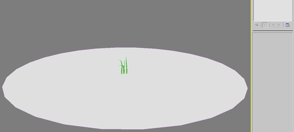
Okay, we will begin by modeling a cluster of 4 or 5 grass strands that we can later use to create a patch.
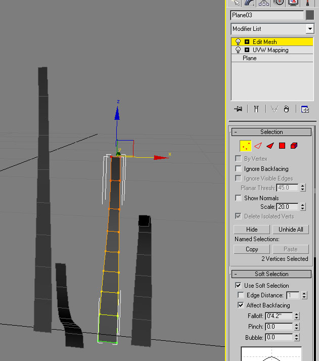
  • Create a plane to represent an individual grass blade. I made mines about 4″ (inches) high and about 1/4″ wide. Give it multiple segments lengthwise so that you can shape it.
  • Apply a UVW Map to it now before we shape it.
  • Apply an edit mesh modifier
  • Copy this blade over 3 or 4 times so that you can have different shapes of blades. Using soft selection, taper, stretch, and bend each blade as you like to represent the actual curvatures of real grass. Get as creative as you want here.


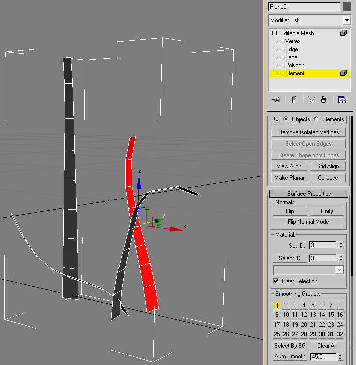
  • Rotate each blade as you wish to create some variation
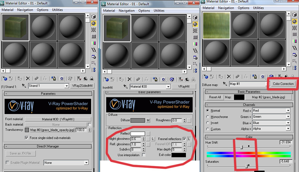
  • Collapse the modifier stack and attach all the blades to form one object. Give each blade a different material ID from 1 through 4.
  • Create a multi/sub-object material with 4 material slots (or 5 depending on how many blades you created). Make each material a vray2sided material. This will allow for nice translucency.
For the next step, you can create your own grass blade texture, or use this one which I created:


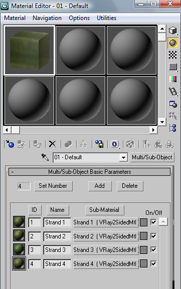
  • Set the following material settings: reflect = white, fresnel checked, and highlight glossiness at .6 to create more efficient highlights.
  • Create a “Color Correction” type on the diffuse box and apply the grass jpg to the map slot. This will allow you to add variation of tones to each blade.
  • Play with the sliders as you like to create the hues you are looking for. Do this for each of the 4 material ids and apply this material to the cluster of grass we created.
  • Optionally, set the opacity map on the translucency channel of the vray2sided material slot.

SECOND STEP: CREATE PATCH OF GRASS
  • Begin by creating a circular patch of grass (circular will blend better then rectangular shape). Create a flat circular plane with about a 2 foot (~600 cm) radius. I just created a circle and extruded with 0 inches. Make sure your normals are pointing up. Should look something like this:
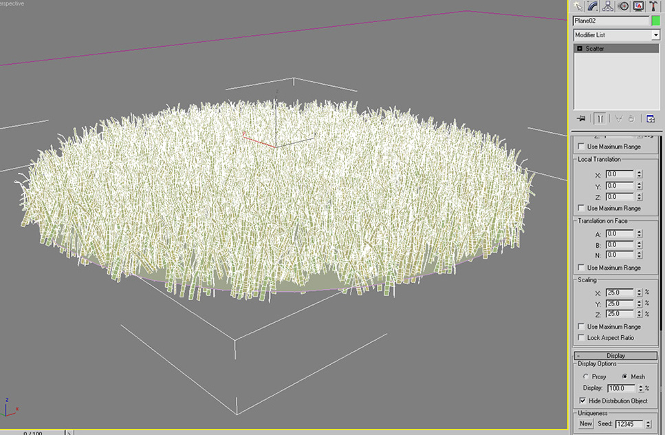
  • Now select the grass clutter and under compound objects, apply a scatter modifier.
  • Set the round plane as the distribution object.
  • Set the following scatter settings: copies=2000, set distribution to area, uncheck perpendicular, hide the distribution object, set the rotation on your z-axis (or y-axis depending on your setup) to 360 degrees, set the scaling range to 25 percent across the board, and make sure your display is at mesh and at 100%.
THIRD STEP: CREATE A VRAY PROXY
Now we will convert this patch of grass we created to a v-ray proxy. We can forever use this proxy on all our drawings. If you are not familiar with v-ray proxies, you can find more information here.
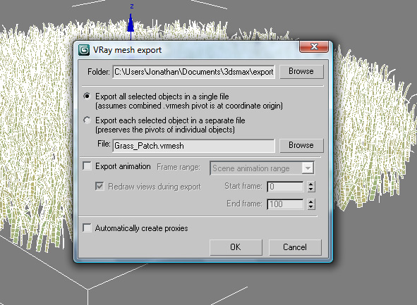
  • Start by deleting the circular plane, this was only to create the distribution area.
  • Right click on the grass patch and select “V-ray Mesh Export”. The Mesh Export dialogue will come up. Select a folder to save this proxy in. Remember you can to re-use this proxy on all your future drawings so you might want to make it an accessible folder. Select “Export all selected objects in a single file”. Assign a name to this proxy and hit OK. Now you have your grass patch proxy saved.
  • Make sure you save the material you created into the library for future use.


FOURTH STEP: SCATTER THE VRAY PROXY BY PAINTING
Alright so now we will expand further on the technique of spreading the grass patch by painting the proxies. For this we will use a very nice piece of software called GroundWiz by Gugila. You can download a free version of this software here. Although GroundWiz has many more uses then the one we are giving it, it serves our purpose nicely and it’s very simple to use.
  • Begin by inserting the proxy you created into the drawing. Do this by selecting “v-ray Proxy” under the “V-ray” category of geometry. Click anywhere in the 3d space and when it asks you, select the proxy you created. Set the display to bounding box, and you will see that the patch will display as a simple rectangular box (taking up less memory). However when rendered, it will render as the grass patch.
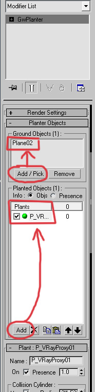
  • Now go to the “GroundWiz” category of geometry and select “GW Planter”. Create a planter anywhere on your drawings.
  • Set the distribution settings as follows: First pick your ground plane to be the ground object, and the proxy (grass patch) to be the planted object.


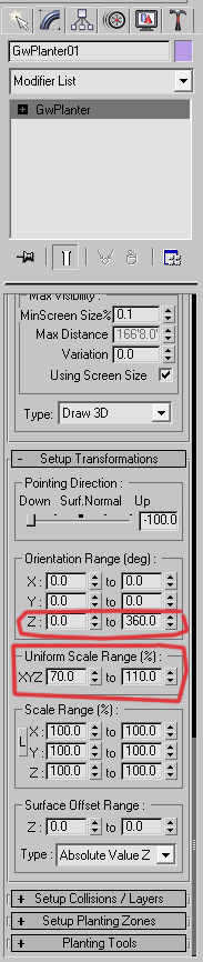
  • Set the “Uniform Scale Range%” from 70% to 110%. This will fluctuate the size of the grass to create variety. Make sure the “Orientation Range (deg)” Z-axis is set from 0 to 360. This will create random rotation of the grass.


  • Now we are ready to plant:
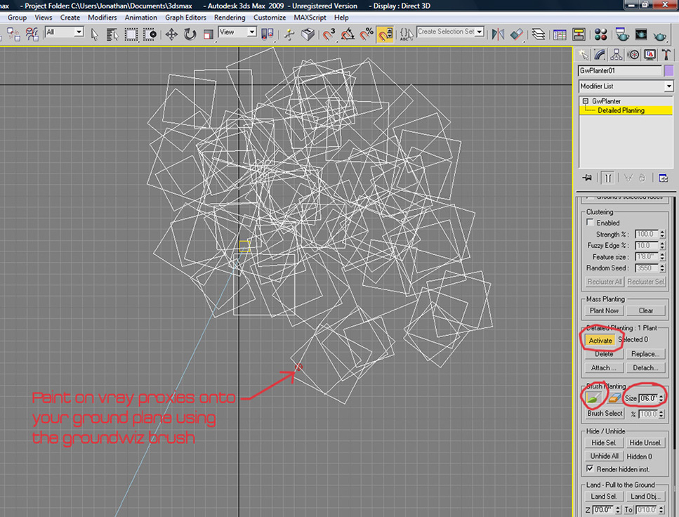
  • Go down to the “Planting Tools” section and expand it.
  • Select “activate” under “Detailed Planting”. Set brush size to around 6″ (the bigger the brush, the more proxies it will spread).
  • Start painting proxies onto your ground object. Paint more near the camera where you need more detail, and less as you get further. Also, stay within the camera’s field of vision; there is no need to paint outside of it and use up resources.


Once done, keep “Detailed Planting” on to allow you to edit your created proxies; you can erase the ones you don’t need and/or move them if need be. Render. You should have something like this:


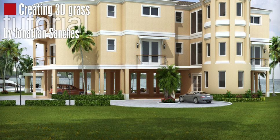
If you have bald spots, go back and paint proxies in. Also, make sure to give your ground plane some sort of grass texture so that any areas of it visible through the grass can blend in. As you can see, the grass spreads out very nicely and seamlessly. To create a more realistic carpet of grass, you might want to create different patches, some with longer strands and others with shorter strands maybe even flat-looking. You can use this same technique to scatter falling leaves from nearby plants. You can scatter flowers bending in the wind. You can get as creative as you like. Observe real-world grass and you’ll notice that there is great variety of grass styles and shapes. Good thing about this technique is that once you create a patch, you can reuse it however many times you like.

Jonathan Sanchez

19 May 2010

Drawing art with paint brush...


Give your suitable comments

CorelDRAW Graphics Suite X4 - VTC

alt
alt
VTC.CorelDRAW.Graphics.Suite.X4-iNKiSO
450MB | RS & HF & FF | Release Date:May 11, 2010
Hotfile Links:
http://hotfile.com/dl/42504314/d3d60b0/i-vcdrawgsx4.part1.rar.html
http://hotfile.com/dl/42507121/421881d/i-vcdrawgsx4.part2.rar.html
http://hotfile.com/dl/42504341/81193c6/i-vcdrawgsx4.part3.rar.html
http://hotfile.com/dl/42507122/1a8a9fb/i-vcdrawgsx4.part4.rar.html
Filefactory Links:
http://www.filefactory.com/file/b19hg80/n/i-vcdrawgsx4.part1.rar
http://www.filefactory.com/file/b19hg81/n/i-vcdrawgsx4.part2.rar
http://www.filefactory.com/file/b19hg82/n/i-vcdrawgsx4.part3.rar
http://www.filefactory.com/file/b19hg7b/n/i-vcdrawgsx4.part4.rar
Rapidshare Links:
http://rapidshare.com/files/386389889/i-vcdrawgsx4.part1.rar
http://rapidshare.com/files/386389878/i-vcdrawgsx4.part2.rar
http://rapidshare.com/files/386390307/i-vcdrawgsx4.part3.rar
http://rapidshare.com/files/386388183/i-vcdrawgsx4.part4.rar

18 May 2010

Making connections with Flash and FlickrShowcase your images in Flash from your Flickr account by following Anton Mills’ step-by-step guide

Showcase your images in Flash from your Flickr account by following Anton Mills’ step-by-step guide

For this tutorial we will learn the basics of the Flickr Application Programming Interface (API) and roll it in to an image viewer we can use as our portfolio.

For budding Flashdevelopers, the notion of connecting to a website’s Application Programming Interface (or API for short) can be an intimidating thought. If you’ve never used an API before or fancied learning the basics of how to use Flickr’s own, then this is for you. Flickr’s API is extremely user friendly, comprehensive and, most of all, fun to use! It was the first I ever used, and I’d wager that once you get your first few pieces of data returned from the API you’ll be just as hooked as I am.

In this tutorial we will cover getting the API keys you’ll need, using Flickr’s API Explorer and tying Flash and Flickr together with an image viewer. Before you begin though, if you haven’t already, you’ll need to create a Flickr account.

Click here to download the support files (991KB)

Click here to download the tutorial for free

17 May 2010

Build a custom WordPress theme

Convert static HTML templates into a dynamic WordPress theme, no PHP skills required – just follow Nick La’s copy-and-paste instructions

Creating a WordPress theme is extremely easy, as you don’t need any PHP programming skills.

However, in order to create a custom theme you need to be able to code your own HTML and CSS templates. Coding the theme on a local computer can also save a lot of time because you can quickly preview it and can avoid the hassle of uploading the files to the server.

We will also follow the structure of the default WordPress theme to create a custom theme from scratch, walking through how to convert a HTML template into a WordPress theme. All you need to do is copy and paste the PHP code from the default theme. After you complete this tutorial, you should understand how a WordPress theme works and be able to create your own. You will find a copy of the HTML template for this tutorial included in the support files.

Click here to download the support files (1.48MB)

Click here to download the tutorial for free

16 May 2010

Create 3D elements in Flash

2D character animator Tom Baker helps you get to grips with the new 3D tools in Flash CS4 to create some dazzling results

Flash has come a long way since its early web-based vector days, and the newCS4 version boasts some pretty impressive extra features, such as the ability to create 3D layers ‘postcard’ style. It’s already the 2D animation package of choice for most of the major animation studios in London (Cartoon Network and Nickelodeon to name but two), but with CS4 expanding into the realms of 3D, there’s never been a better time to get to grips with the program if you’re an aspiring animator.

In this project, I run you through the basics of the new features. The following steps reveal how to animate 3D layers by creating a movie clip of a simple magician character converting a 2D box into 3D, which we animate with keyframes. The process takes advantage of the improved synergy between Flash CS4 andPhotoshop CS4 – importing elements from the latter to add visual flair – and will result in a character that’s ready to export into After Effects.

You will find a finished working version of the FLA file in the support download in case you get lost at any stage, plus a movie clip showing how it should end up looking.

Click here to download the support files (2.57MB)

Click here to download the tutorial for free

14 May 2010

Create organic 3D ribbon effects

Go with the flow to generate a series of stunning, colourful Flashpatterns, writes Stewart Hamilton-Arrandale

Free-flowing ribbon effects have been given a fresh lease of life through ActionScript 3.0, enabling designers to create organic effects that react to user interaction and display as clear, crisp and bright colour ribbons.

Dozens of online and TV-based ad campaigns have been reintroducing these elements to sell everything from cars to PCs, so it’s a trend on the rise and a skill worth having in your tool box.

In this tutorial I’ll be showing you how to create these organic ribbon visuals using some of Flash Player 10’s new drawing functions – but nothing we’ll be doing will be Flash Player 10 specific. I’ve set up the parameters already, and we’ll run through them, explaining what each does, so that you can use the files as a template for creating your own ribbon effects (and at the same time learn some of the new data types and the new improved drawing API in Flash Player 10).

Click here to download the support files (478KB)

Click here to download the tutorial for free

10 May 2010

All-new abstract illustration techniques


In this tutorial I will show the Polar coordinates filter techniques I discovered when creating my new series, Renaissance.

As always, in this tutorial I use standard effects inPhotoshop – not additional plug-ins – focusing more on how to use them rather than what they do.

It’s not tools that make the piece great, but what you do with those tools; it’s more about pushing boundaries and trying out new perspectives on techniques.

Click here to download the tutorial for free


4 May 2010

Animate characters in Flash

Character animator Tom Baker takes you through the basics on how to import, set up and animate simple 2D characters in Flash

Life is about progression. For those artistic types out there, your first dalliances into creativity might have been scribbling on a piece of paper with a pencil or crayon. Over the years, you may have progressed from pencil to pen, from pen to paint, and finally from paint to the graphics tablet. You can now produce images that would have dazzled your crayon-wielding former self, but why stop here? It’s now time for you to take the next step: to make your characters move.

This project is ideal if you can create characters in either Illustrator orPhotoshop, but have limited experience withFlash. Over the following steps, I demonstrate how simple it is to set up character files and simple animations in Flash, with minimal need for redraws using character ‘setup’ files created in Illustrator.

Here, I use my file, skullman.ai, which you’ll find in the support files – but there’s no reason why you can’t use your own character. Detailed knowledge of Flash isn’t required, but before you start it would be helpful to be familiar with basic Flash CS3 and have some knowledge of how to make symbols, the timeline, onion-skinning, and how to navigate between symbols.

Click here to download the support files (529KB)

Click here to download the tutorial for free

3 May 2010

20 outstanding Illustrator tutorials

Score yourself new vector skills with this collection of our Illustratorguides from the past year

It's high time for another round-up of our Illustrator tutorials to save you the pain of having to search for them yourself.

Incredibly, since the last time we did an Illustratorround-up we've managed to acquire another 20 tutorials from an assortment of highly talented people, covering a splendid range ofIllustrator topics. Cast your eye down this latest list and you'll see contributions from the likes of Jessica Walsh, James Wignall, Peskimo, Lunartik and Tom Lane, covering subjects as diverse as typography, portraiture, isometric art and logo design.

It's not just Illustrator, either; quite a few of tutorials in this collection encourage you to use Illustrator as a stage in your workflow, to create work that you can then continue in other packages to give your finished imagery a less obviously vector look.

There's advice here suitable for everyone from beginners to Illustratorexperts, so jump in and you should find just the thing to raise your skills to the next level. Enjoy!

1. Design organic type

Sarah Coleman reveals a digital shortcut to recreate an organic hand-made type effect, usually achieved using lots of ink and bleach

2. Design lettering with negative space

Jawa and Midwich reveal how to utilise hundreds of illustrations to build up a positive space containing negative letters

3. Bring your themes to life in type

blindSALIDA shows you how to reflect your image’s inspiration through type, using Illustrator to generate a blown-about lettering effect for a song title

4. Texturise your layered vectors

Pokedstudio shares some techniques for creating multi-layered vector-based images that also have a textured, collaged look

5. Create retro-look vectors

James Wignall, AKA Mutanthands, demonstrates how to take your digital vector illustrations back in time

6. Create your own monster

How do you give a fictional creature a distinct personality? Peskimo explain how to design a convincing monster

7. Cast a designer toy

Collectable figures are a massive global industry. Lunartik reveals how to get your hands dirty and make your designs a reality

8. Roughen up your vector work

Vector work and an authentic look needn’t be mutually exclusive, as Ollie Munden proves by bringing hand-drawn details to bold vector art

9. Geometric shape and pattern explorations

Shape up with oriental-inspired illustrations, made easy by designer Tom Lane

10. Give your sketches a facelift

Chris Malbon reveals how to transform your old doodles into cutting edge portfolio-boosting work

11. Create an iconic logo design

Jacob Cass shares his insider knowledge on how to create a simple but effective logo design

12. Re-style street art

Bored with graffiti-style graphics? Daniel Westwood demonstrates how to put a modernist twist on street art staples

13. Perfect vector portraiture

Digital portraiture is as in demand as ever, particularly for editorial. Simeon Elson shows you how to get in on the act the easy way, whatever your style

14. Design seamless character patterns

Repetitive character prints are everywhere. Lo-Fi Creative’s Anna Wray shows you the fast route to creating your own

15. Playful typographic treatments

The possibilities for adding humorous appeal to your type designs are limitless. Jessica Walsh shows you how to whip your letters into shape

16. Cross-platform character design

Ben Mounsey shows you how to create characters that are easily transferable across the range of modern ad display mediums

17. Illustrate Havaianas’ world

Adhemas Batista reveals how to carry a visual style across different media for a big-name brand

18. Isometric vector art made easy

Aaron Miller demonstrates how to take the pain out of pixel art

19. Create a typographical logomark

Ariel Di Lisio reveals how to transform an existing font into a unique, attention-grabbing logo

20. Master repeat plaid patterns

Digital textile design specialist Melanie Bowles shows how to create a signature plaid and prepare it for print

2 May 2010

Master dynamic gradient techniques

Many works that look complicated are really made from simple elements. In this tutorial, Russian artist Alexandra Zutto shows how to build up complex, beautiful images by patiently layering and building up small, straightforward segments, always varying them to prevent monotony.

For this piece, which Zutto created for the Blood Sweat Vector exhibition in Berlin, she says: “I tried to reproduce the tundra’s atmosphere, with its pale sun and soft lighting. It required looking closely at a lot of references to understand how I can achieve these kinds of effects.”

In this tutorial, you’ll learn how to build up many elements to create a vector image with real depth and richness. Zutto explains: “I spend most of the time picking out colours that match each other to form harmonic colour composition. It takes a lot of time, but it’s worth the effort.”

Step 1 - I recommend making sketches first to help you get the composition right: it’s easier to draw nice shapes on paper than make them in software from scratch. Scan in your picture. You can adjust brightness and contrast in Photoshop and outline it with a thin, hard brush to make lines crisp if they aren’t. Import it to Illustrator in an empty layer and lock it (Cmd/Ctrl + 2). I usually set the sketch to 30% transparency.


Step 2 - Let’s start with the owl, as it’s the main figure that defines the composition. Create a new layer and start drawing an eye. With the Ellipse tool (L) create a circle, making sure there’s no stroke. Create a radial gradient using several shades. Adjust the colours and position of the sliders using the Gradient tool (G) and Gradient toolbar. Refer to close-up photos of animals to understand how lighting goes through the eye

Step 3 - Using the Ellipse tool or Pen tool (P), draw the pupil of the eye. Then add some reflections with 10-20% transparency. To add depth, I made a glossy reflection using a radial gradient of opacity (create a two-colour gradient with the same colours and make the outer colour transparent). Select all eye shapes and group them (Cmd/Ctrl + G).

Step 4 - To make the beak, first draw a round shape and fill it with a base colour. Using the Mesh tool (U), add some columns and rows. Move mesh points with the Direct Selection tool (A) to get the shape of the beak, then fill the outer points with darker colors to add volume. Then add some details (such as reflections and nostrils) with the Pen tool.


Step 5 - Now let’s do the feathers. In a new layer, draw an oval and drag its bottom anchor point with the Direct Selection tool. Fill it with a gradient from top to bottom. Place the feather layer under the eye layer.

Step 6 - Hold down Alt and drag to make copies of the feathers. Then, using the Selection tool (V), distribute copies of the feathers around the eye. Adjust the scale and rotation for each feather to make them a little chaotic – this gives the picture a more realistic look. Continue adding feathers, placing them around the eye area.

Step 7 - When you’ve finished placing the feathers, adjust some of the gradient colours to add a little variety and contrast. To do this, I selected some of the shapes and made the gradient colours darker. Select the eye and all the surrounding feathers and make a copy (Cmd/Ctrl + C), then reflect them (right-click > Transform > Reflect > Vertical). In the same way, continue filling the owl’s head and body with feathers. Spend a lot of time playing with colours, making some parts of the owl brighter or darker to create the effect of volume.


Step 8 - When the owl’s body is done, draw a tree under it. Fill it with a bright gradient to make it contrast with the eyes. Then, using the Pen tool and gradients, add long feathers on the owl’s head and draw the claws. To add shadows under the claws, copy all the shapes that make up the claws into a separate layer, and unite them with the Pathfinder toolbar. Send this shape behind the claw’s group.

Step 9 - Now we need to make an atmospheric background. I want to make a tundra landscape with a sense of real depth, and soft lighting. Draw a rectangle the full size of your canvas, and place it on a new layer behind all the other layers. Fill this background shape with a gradient with the brighter colour at the top.

Draw hills using the Pen tool and fill them with gradients, making the nearer hills darker than the distant ones to add depth. Draw fog using the Pen tool, fill it with a light colour and make it transparent, placing it in front of the tree shape.


Step 10 - To make furry creatures first we need to create a custom brush. Draw the shape of the brush with the Pen tool and drag it into the Brush panel (F5), choosing Art Brush. In Options, choose the direction and don’t forget to tick Proportional to get each brush strand a unique size.


Step 11 - Make the body of the creature and, using our custom brush, draw strands around it. When all the fur is ready, select all the strands and expand them (Object > Expand Appearance). Then, using the Pathfinder tool, unite all the fur with the body shape. Apply a gradient and add details like eyes, ears, nose and so on. Make several different characters with the same technique and arrange them in your composition.

Step 12 - To create the environment, begin making little elements such as grass, plants and stones. Draw several grass shapes and fill them with different gradients, using transparency to make them look as though they’re shrouded in fog. Copy groups of grass to save time. Fill in the background with similar elements, making distant layers lighter.

Step 13 - The next step is adding a light source. In tundra, the light is pale and scattered. So make a simple circle and fill it with Light Radial gradient. Make the outer colour of the gradient fully transparent. Adjust the gradient sliders to give softness to the sun’s shape. Use this technique to make small particles and distribute them over the picture.


Step 14 - If you want to add some other creatures such as deer in the background, find some pictures of them, and outline their shape and place them in the background.

Step 15 - To give a sense of magic, I’ve added some rainbows. Make some round shapes and fill them with a gradient that consists of some bright colours in the centre and is transparent inside and outside. Vary the transparency of them between 10-50%.

Step 16 - Now we need to add some finishing touches to the picture. Create some shapes in the same way as you made the sun, but in different colours. Make them nearly transparent and place them on the picture where you want to add some additional soft light.

Alexandra Zutto

Apply to be a Chitika Publisher!
Follow on Buzz